My 80:20 reference here is to the Pareto principle: 80% of your outcomes come from 20% of your effort. Or in the case of mastering a new skill or tool like Microsoft Excel – 80% of what you use Excel for regularly will come from 20% of the Excel skills you have learnt.
Why am I sharing this? Far too often, every time we sense the need to pick up a new skill or gain mastery of a new domain – be it AI, Data Analytics, Project Management – the default approach is to get into a class or a training program.
The thing about classroom learning and training programs is that they aim to give you the 100%. They start with the ABC, and move on to the complex aspects, aiming to provide a comprehensive learning experience.
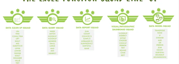
The problem is – none of us need 100% mastery to get our work done. Out of the available techniques or features a tool or programming language has, only 10-20% will be relevant for the average knowledge worker’s day to day work. For instance, Microsoft Excel has 450 functions, but most Excel users need to use about 5-15 on a daily basis. I created a grouping about 4 years ago on the most relevant Excel functions across the 5 generic groups of Excel tasks – Data Cleaning, Data Querying, Data Modelling, Data Reporting and Data Visualization.

So – how do you focus on what techniques to master, particularly in Microsoft Excel? Functions are just one part of Microsoft Excel – there are Features, Formatting, Formulas and Form Controls to master to be able to do productive work in Microsoft Excel. The primary question to ask to figure out where to concentrate your learning on Excel is this: What is my key Excel task? The key Excel task for majority of Excel users is one or two (three in a few cases) of the following:
- Data Collation: compiling data from data sources into an Excel spreadsheet. It could be simple data entry – entering in data from physical records into cells in an Excel worksheet, or data import from websites or databases, or entries from filled data forms.
2. Data Cleansing: preparing entered data for subsequent analysis. This may require reordering of the data to yield meaningful results, removal or alteration of incorrectly entered data, and handling of outliers that may distort the results of the data analysis.
3. Data Reporting: asking the data “What happened?” questions. This is also known as descriptive analysis. The output – data reports – present the data in tables that showcase a summary of outcomes and key insights. Data Visualization is an offshoot of Data Reporting as it utilizes graphical elements like charts, bars and colors to visually represent the information in data reports.
4. Data Querying: asking the data “Why did it happen?” questions. This is sometimes known as diagnostic analysis. Data querying ranges from a combination of simple one-line queries “What was the sales in March last year?” to complex correlation analysis confirming the other data dimensions that changed about the same times sales dipped in March of last year.
5. Data Modelling: asking the data “What will happen” questions. This is sometimes known as predictive analysis. Data modelling employs forecasting techniques, mining historical data for patterns and trends and utilizing these to build a picture of future performance.
Data Analysts execute all 5 key tasks, but most other users will not need to execute tasks beyond (3) or (4). The vast majority will not need to go beyond (1). 1 out of 5 is essentially 20% – hence the 80:20 rule is now in effect.
Once you have identified your own key Excel tasks, deepen expertise in them. Start with asking: What is the range of Data Collection / Data Cleansing tasks that come up in the course of my work? Outline them and the main techniques to be mastered to get each done.
After the above is done, you can ask the Optimization questions. These are:
How can I communicate the output of my Excel tasks better? Invest in learning Excel presentation techniques to make data output easier to read. These techniques include removal of chart noise, gridlines, artistic use of fill color and font color formatting, usage of header, footer and print preview panes to optimize printed output
How can I improve my productivity – get more quality work done in less time – in Microsoft Excel? Productivity in Microsoft Excel is unlocked at three levels. The first is utilizing templates to get work started faster by maintaining placeholder for repeated reporting elements. This can look like maintaining a formatted Excel worksheet for daily reports so that only the daily numbers need to be updated: the header, table row and column and other formatted elements remain the same. The second level is mastering keyboard shortcuts to get work done faster with fewer keystrokes. And the third level is automating data entry, cleaning, reporting, modeling and visualization through VBA macros.


No Comment! Be the first one.